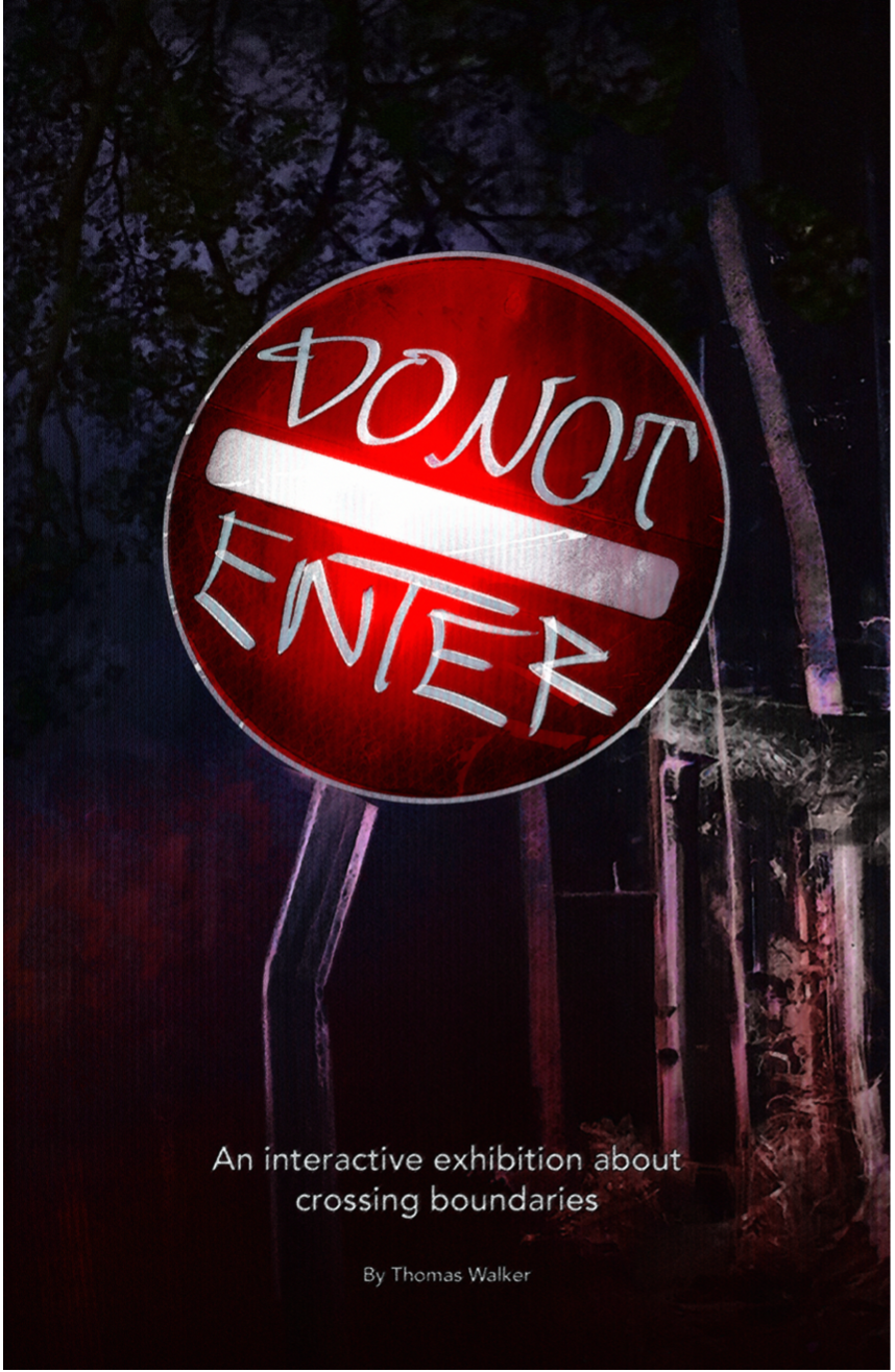
OVERVIEW
Do Not Enter is a multifaceted series of 15 digital works which confront the complexities of Christian evangelicalism and queer storytelling. Inspired by the hellish journey of Dante's “Inferno”, the series guides the audience through a macabre sequence of interactive interfaces and motion media videos.
Many of the visuals take inspiration from the found footage horror genre, echoing films like The Blair Witch Project and the Backrooms web series. Additionally, the interactive elements appropriate familiar user interfaces like webpages and mobile apps by presenting them with affecting narrative implications such as in Emily is Away and Five Nights at Freddy's.
STUDENT BACKGROUND
I received my undergraduate degree in Computer Science with a minor in Game Design where I developed projects such as an iOS app and multiple games developed with the Unity game engine. My degree culminated in an exhibition of poster prints featuring Augmented Reality content viewed through a smartphone (see here).
From the skills I gained in my undergraduate studies, I progressed to the ITGM major at SCAD where I am a Graduate Fellow on the Interactive Design, M.F.A. track. In my career following SCAD, I aspire to design engaging and thought-provoking interactive installations and serious games. I also have a passion for research and am considering professorship after acquiring industry experience.
Exhibition Flyer (Draft)
EXHIBITION DESIGN
The work will be presented as a physical installation designed to guide viewers through a linear narrative while also allowing open exploration. The exhibition space will feature a sequential arrangement of pieces presented on screens or projectors with both interactive works and looping videos to view. I am planning on exhibiting at a local church space in Savannah (see below).
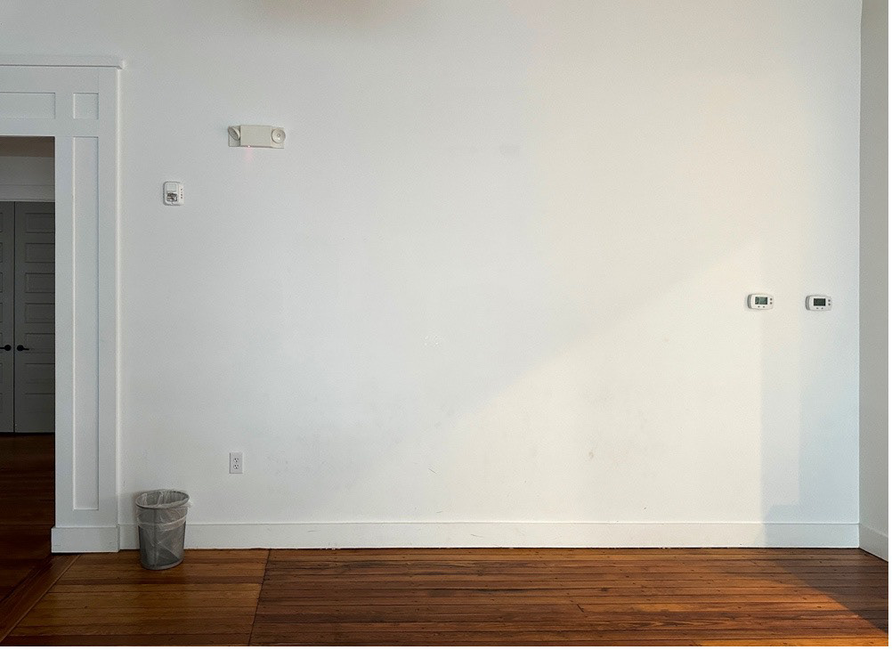
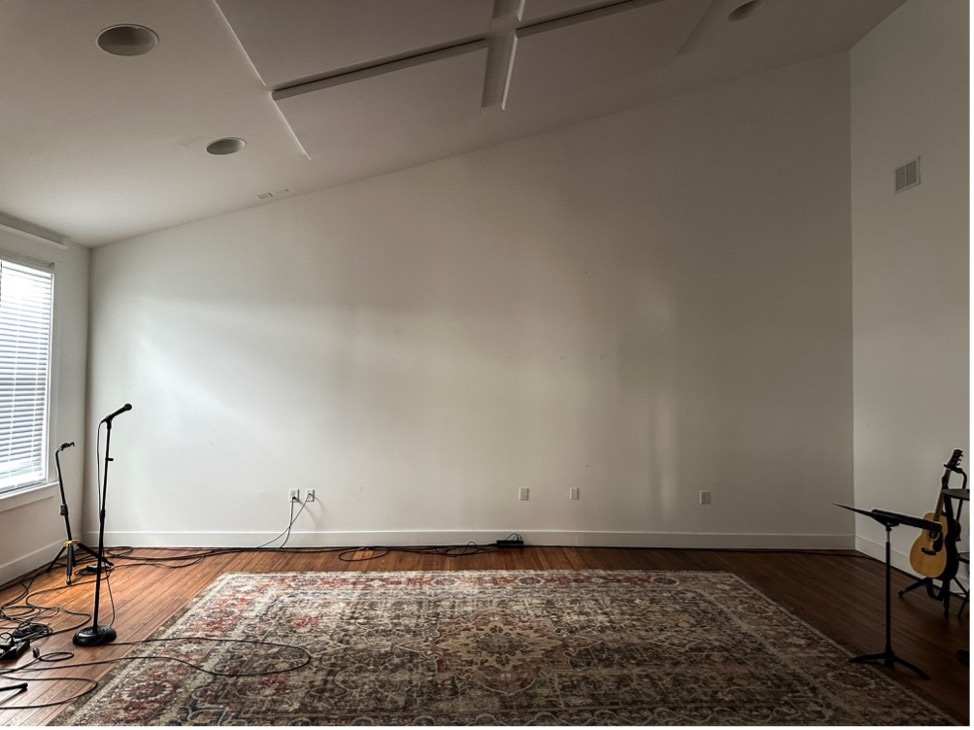
Some of the walls in the exhibition space
This will act as a framing device for audiences to understand Do Not Enter as thematically addressing religion. I will also host the art works on my website so that the series can be viewed online as well. The overall narrative of the series is presented in fragments throughout the pieces, inviting the audience to uncover the underlying meaning of the works. This exploration will encourage audiences to revisit pieces and attempt to initiate novel interactions as found in installations by Meow Wolf or with digital elements in some escape room experiences.
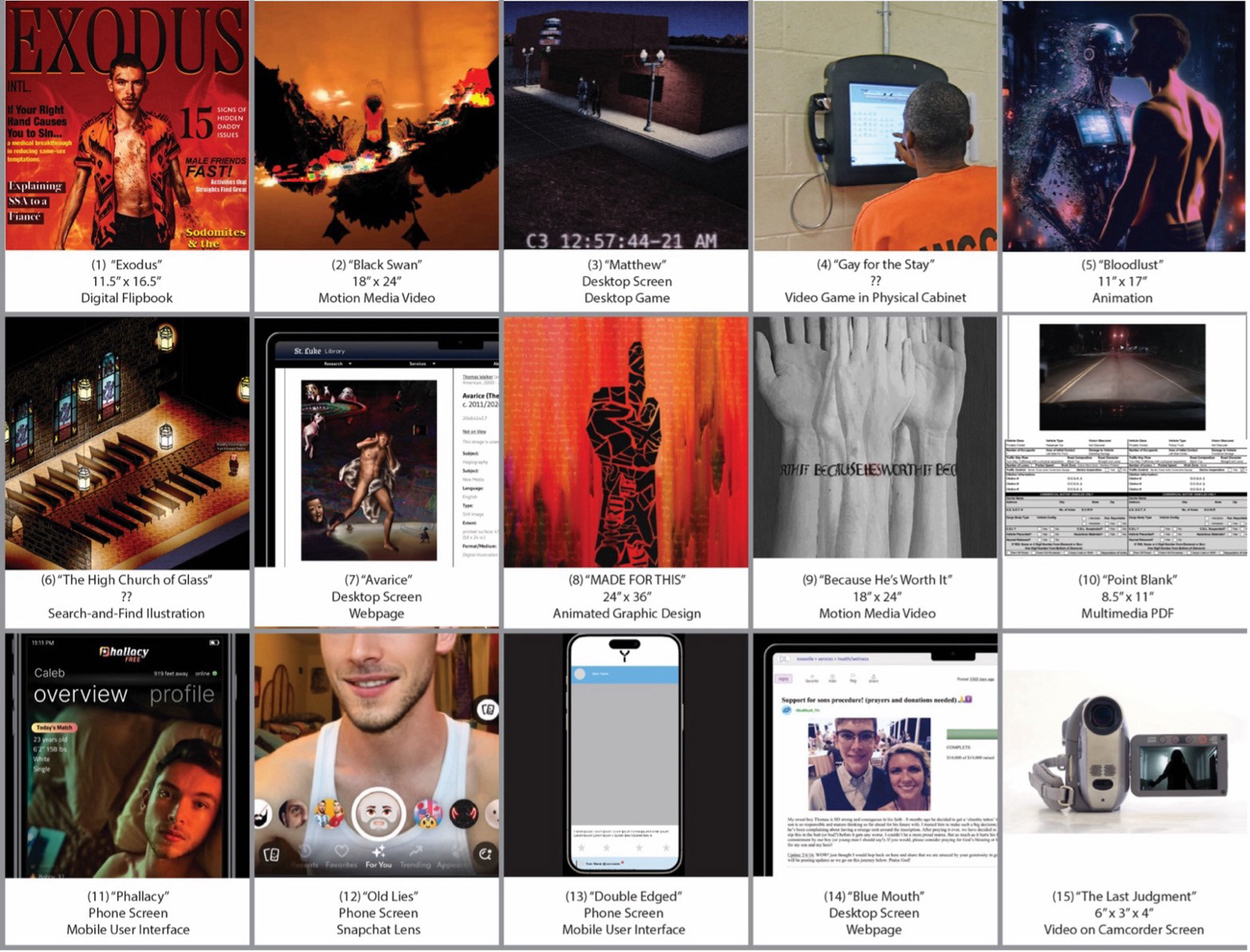
Here are thumbnails of each piece which list their sizes and mediums. Their curation is based on Dante’s “Inferno” in which each piece represents a circle of hell, guiding the audience through increasingly visceral representations of human fallibility.
INSPIRATIONS / SIMILAR WORKS
The pieces are a form of new media art rooted in Conceptualism such as in the work of Félix González-Torres, where the concept or idea involved in a work is more important than its aesthetic or material qualities. The themes of queerness and identity will also place it within the landscape of identity-based art, with a haunted sense of being surveilled and scrutinized by society similarly to works like Cindy Sherman’s self-portraits. And my employment of visual distortion, dark humor, and psychological suffering warrants comparison to Expressionist sensibilities like that of Francis Bacon’s paintings.
The exhibition will additionally utilize innovative or creative technology with gimmicks like the use of live camera footage in “Old Lies”, or the dialogue simulation of “Gay for the Stay”, which promotes reflection on digital media, and the audiences’ role as a participant in online spaces. I am conducting further research into how I can compare the technological aspect of this work with other fine arts projects.
INTENDED AUDIENCE
Do Not Enter is designed for a diverse audience, particularly those interested in exploring the intersections of religion, sexuality, and cultural critique through contemporary art. Its primary audience includes academics and students in fields like new media art, queer studies, and theology, as well as art enthusiasts and professionals who engage with conceptual and technological works. The project also resonates with queer communities, especially individuals with experiences in religious spaces, and religious reformers who seek to reflect critically on Evangelical culture. Lastly, it appeals to a broader audience interested in societal norms, masculinity, and the commodification of identity.
BROADER IMPACTS
The project aims to challenge assumptions, provoke dialogue, and offer critical reflections on the ways religious and queer frameworks shape personal and collective experiences. Each piece in the series contributes to a larger conversation about disembodiment, spirituality, and social structures, with a focus on the unique struggles and stories of queer individuals navigating these spaces. Its impact lies in its ability to evoke empathy and inspire deeper conversations about the intersections of faith, sexuality, and the human condition in contemporary culture.
In the following pages, I explain each individual piece, with many having links to prototypes or final versions of them to test. I hope this proposal has conveyed the vision of the project; thank you for taking time to read it. I look forward to feedback as I continue refining and deepening these ideas to create a meaningful and impactful body of work and exhibition.
Individual Piece Statements
1 - “EXODUS”
“Exodus” is a satirical, faux-magazine inspired by the legacy of Exodus International, a now-defunct Christian organization that once promoted harmful “conversion therapy” practices. The 'magazine' combines images and articles from their closed website with my own writings and media. This piece represents a harrowing spiritual journey—or exodus—within a toxic religious landscape, highlighting the lasting impact of these discredited practices that continue to harm individuals today. The piece also introduces the fictional “samesextomy,” a grotesque medical procedure to “remove same-sex attractions” through literal amputation, partly inspired by Matthew 5:30—“And if your right hand causes you to sin, cut it off.” From here, the isolated human arm becomes a recurring visual motif across Do Not Enter, symbolizing both the physical and psychological violence of attempts to erase or alter one's identity.
2 - “BLACK SWAN”
This video consists of footage from social media and television broadcasts documenting the 2016 forest fires in Gatlinburg, TN, a tourism town with scenic Smoky Mountain views and a kitsch southern charm. In November 2016, flames tore through this cabin-dotted landscape, leaving behind destruction and despair. The fires, one of the largest Tennessee has seen, claimed homes, businesses, and 14 lives. Against this backdrop of loss and upheaval, this piece serves as a poignant reminder of the grief that accompanies leaving behind the familiar, as well as the power of Christian faith. The piece draws inspiration from the symbolism of the black swan, which has become an analogy for when a surprising twist of fate upends our core beliefs, but can be easily rationalized after the fact. In this work, it serves as a metaphor for an unexpected tragedy with dire consequences, reorienting our perceptions of the past and altering the course of locals' lives.
3 – “MATTHEW (Pending Title)”
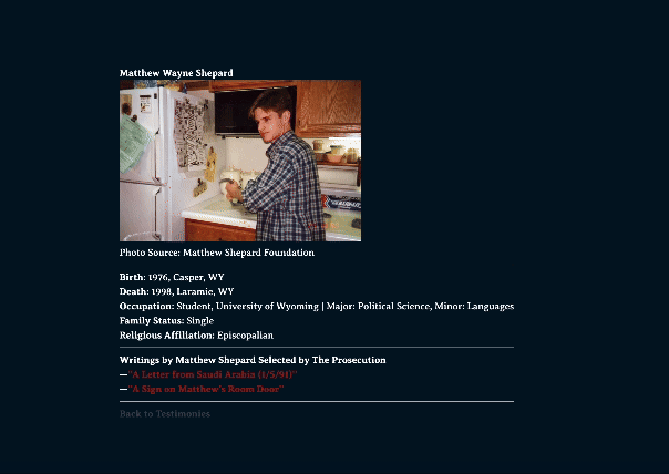
This is a narrative-driven exploration game in which the player seeks to find closure with the tragic murder of their loved one, Matthew Shepard, by investigating why the killers targeted and attacked him. The player visits key locations related to the murder and reviews primary sources such as court testimonies, forensic evidence, and media to ultimately form their opinion in order to process their grief. The purpose of the game is to educate the player about the 1998 murder of Matthew Shepard, a significant turning point in the legislation of LGBT+ rights in the United States, with an interactive and engaging experience. The game content is primarily nonfictional and documentary in that the narrative is heavily based in factual information. In Do Not Enter, it serves as a reflection on queer violence and how society responds to it in the conservative American context the series exists in.
4 – “GAY FOR THE STAY”
This branched dialogue game allows the player to converse with a prisoner character on a screen, simulating the digital visitation system used in some prison systems. The physical work is a small arcade cabinet in the style of prison visitation systems, with buttons to ‘speak’ with the prisoner. The story will follow a middle aged gay man recently incarcerated and his evolving relationship with his former lover. The themes explored are the relationship between queerness and homosocial contexts, such as men’s prisons, and the stigma of queer identity. I am drawing character details and story from works related to homosexuality in the context of prisons, such as the play, Kiss of the Spider Woman, and the prison writings of Oscar Wilde. Overall, it will challenge audiences with its interactive mechanics and exploration of difficult societal topics.
5 – “BLOODLUST”
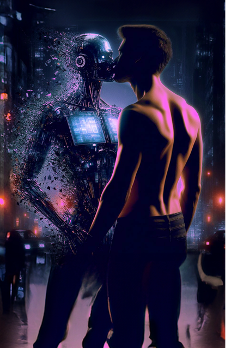
Mockup created with Adobe Photoshop and Adobe Firefly
This will be a digital illustration of a man engaging intimately with a cyber being made up of animated screens and media. The entity will stand rigidly and stare blankly, with the shards of its screens penetrating the skin of the man. The footage displayed on the entity will cycle through highly distorted clips of sexualized men from iconic late 90’s and early 00’s media. The man is illustrated as both drawn to and harmed by the figure as he interacts. This vignette represents the complex relationship between queer men viewers and the homoerotic/pornographic media they encounter, with my specific selection of media representing the context of my coming-of-age. The viewer will most likely recognize the clips utilized in this piece and will be able to reflect on their impact on its original audience, and specifically queer men.
6 – “THE HIGH CHURCH OF GLASS”
This piece is a 2D search-and-find pixel artwork in the style of an isometric, virtual world reminiscent of Habbo Hotel. With avatars and chat boxes, it will simulate a screenshot from a massively multiplayer online (MMO) environment. It depicts an ornate Anglo-Catholic church interior where monastic characters engage in or chat about exaggerated acts of hedonism and substance abuse. This hyperbolic scene satirizes the way Evangelicals often perceive LGBTQ+ Christians, even those who are committed to celibacy as a result of their faith. Despite adhering to traditional biblical sexual ethics, even these communities are frequently criticized as theologically dangerous for existing and fostering nuanced perspectives on faith and sexuality.
While the visuals caricature the fears projected onto these spaces, some of the dialogue will reflect real conversations within these communities which I will render from personal experience. By juxtaposing satire with authentic interactions, the piece critiques the hypocrisy of these stigmatizing narratives, emphasizing the complexity of queer Christians’ experiences. It also draws attention to the predominantly online nature of these spaces, where debates about faith, identity, and belonging are shaped, revealing the stark contrast between caricature and lived reality.
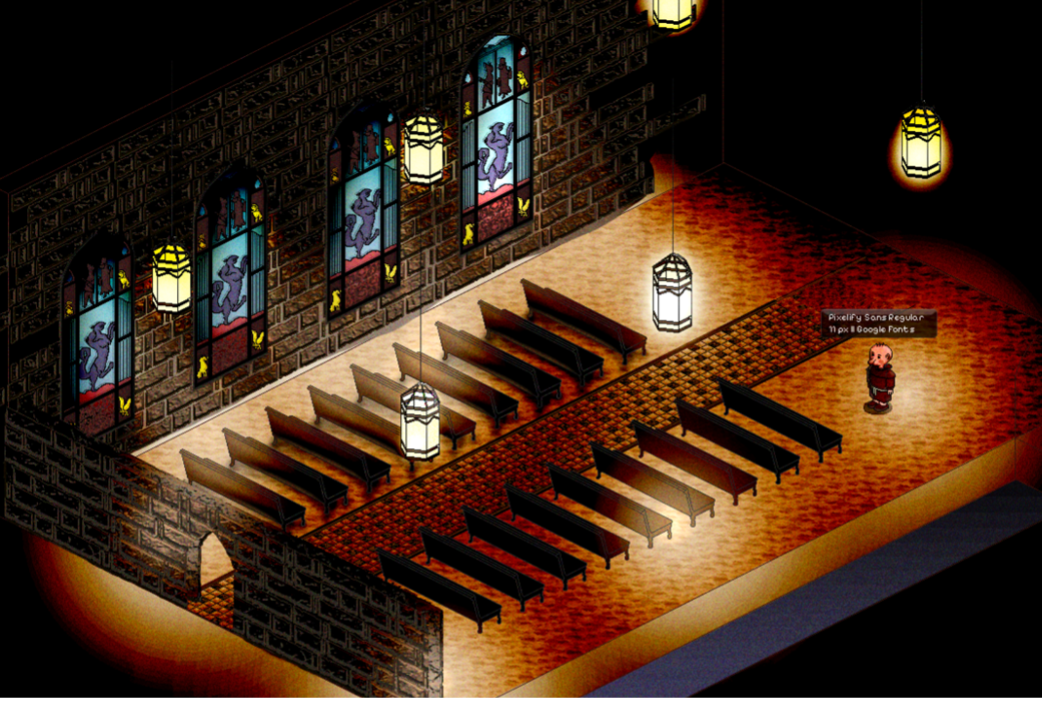
Lighting test for one area of the illustration
7 – “AVARICE…”
This piece is an interactive mock webpage, designed to resemble an art archival website from the far future. Viewers can scroll through the page to explore a digital painting and accompanying text about the artwork explaining its historical and artistic contexts. The painting depicts Saint Aelred of Rievaulx fleeing from surrealist threats, inspired by Dalí’s The Temptation of Saint Anthony and Orestes Pursued by the Furies by William-Adolphe Bouguereau. It speculates on the horror and alienation St. Aelred might experience if confronted with the modern world, where his writings are widely and anachronistically interpreted through a queer lens in contemporary discourse.
The webpage also includes supplementary information about St. Aelred and a postmortem about the painter (myself). While St. Aelred’s biography is factual, the postmortem about myself takes a sharply opinionated and critical tone, highlighting the ways in which queerness, as a framing device, can sometimes inhibit understanding of historical figures rather than enrich it. By paralleling interpretations of Aelred with speculative interpretations of myself as an artist in the distant future, the piece explores how queer readings—though valuable—can distort as much as they illuminate, interrogating the complexities of identity, legacy, and historical memory.
8 – “MADE FOR THIS”
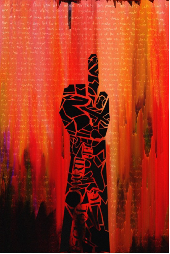
This piece is an abstract digital painting depicting a hand flipping off the viewer with its ring finger, critiquing amatonormativity—the assumption that everyone desires romantic relationships and marriage—particularly as it manifests in heterosexual Evangelical culture. The composition references the raised fist, a symbol of rebellion and social justice, and reimagines it as a challenge to cultural expectations around romance and marriage. Fragmented shapes within the hand reveal abstracted imagery drawn from my personal experiences with amatonormativity, alongside nods to other works in the series.
The background features lyrics from a song used at a Christian summer camp I have worked at—“I was made for this / And you were made for this… We’re a part of a never-ending story / We were made for this”—isolating the words from their original context to provoke reflection on what expectations Evangelical communities place on their members. This is overlaid on a greatly distorted version of the background artwork from Hillsong’s III album, which situates these themes within a broader cultural and religious framework. By combining personal critique with cultural references, the work questions the narratives of purpose and belonging that Evangelical culture imposes, particularly through its lens of romance and marriage.
9 – “BECAUSE HE’S WORTH IT”
This motion media piece documents me receiving a tattoo around my wrist with the phrase “Because He’s Worth It.” This is referring to the first piece in this series, “Exodus”, where I present “Because She’s Worth It” as an Evangelical slogan promoting male chastity. “Because He’s Worth It” inverts this concept as a way to represent an embodied reclamation of my sexuality, identity, and faith from an Evangelical framework. In doing so, it shows how symbols representing sacrifice and self-denial can become tools of self-acceptance and liberation.
10 – “POINT BLANK”
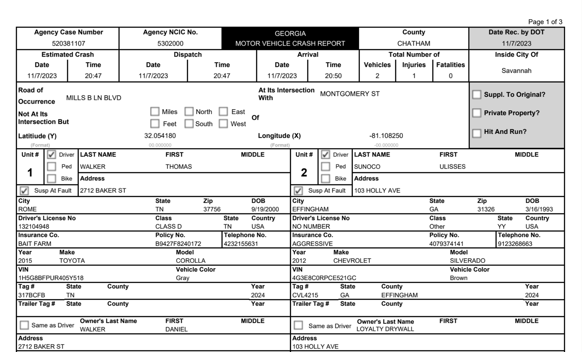
“Point Blank” is a pseudo-autobiographical car crash report PDF integrating graphics and video to critique the reliability of institutional documentation and narratives. The report, authored by a fictional police officer, is riddled with minor errors and an uncharitable narration of my persona, highlighting how bureaucratic structures and human fallibility can distort efforts to faithfully represent reality. Embedded within the report is dashcam footage from one of the drivers, which happens to captures audio playing from the car speakers from an audiobook—Eric Mason’s Manhood Restored. In the excerpt, Mason advocates for limiting the expression of femininity in church spaces and among male church leaders.
The juxtaposition of the crash and Mason’s commentary illustrates how religious-based homophobia can manifest in sincere, ordinary, and/or self-reflective situations, yet remain profoundly harmful. By embedding this rhetoric within a chaotic and unreliable framework, the piece challenges viewers to question how authority and systems of power shape narratives and uphold biases, often at the expense of those they marginalize.
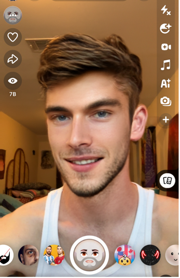
11- “PHALLACY”
“Phallacy” is a speculative design piece that takes the form of a pseudo-hookup app for gay men. It critically examines how similar apps such as Grindr and Scruff exploit harmful social dynamics within the gay community. As the viewer interacts with the app interface, they uncover conversation history and profile details, learning that they are interacting with my persona’s profile in the role of a closeted man in his 50s. The dialogue between my persona and the middle-aged man reveals a mix of loneliness and a desire for connection, tempered by hesitancy and emotional distance on both sides. Additional screens comedically expose the exploitative design built into these apps. Through this interactive experience, the audience gains a glimpse into the darker side of online casual dating and hookup culture (especially amongst gay men), revealing how these platforms can perpetuate isolation, insecurity, and emotional conflict, even as they promise connection.
12 – “OLD LIES”
A Snapchat lens similar to the one I will create

The “Old Lies” logo, parodying “Old Spice”
This piece will be a Snapchat lens filter, created using their development kit, which overlays onto live footage of the viewer and transforms their face into that of a stereotype of a conventionally attractive man. Surrounding the transformed face will be 3D models of red bottles of male grooming products, branded with the logo “Old Lies,” as a parody of “Old Spice.”
The piece critiques how masculine marketing exploits men’s insecurities by promoting an unrealistic, problematic vision of masculinity. It reflects on how this marketing targets young men’s social disillusionment, partly a result of shifting gender dynamics and women’s empowerment over recent decades. By distorting the viewer's appearance and engaging with familiar branding, the piece highlights how masculinity is commodified to sell a lifestyle that capitalizes on feelings of inadequacy.
13 – “Y”
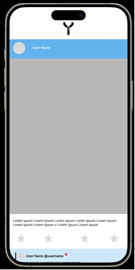
This piece is a speculative design exploring male homosociality and the dynamics of short-form social media through a fictional app for men only called Y, inspired by the user interface of X (formerly Twitter). The central content (currently a gray box above) is a shaky, smartphone video capturing two ice skaters in a heated argument. One skater examines and aggressively grabs the tattooed wrist of the other, referencing the “chastity tattoo” addressed in “Exodus” and “Because He’s Worth It”. The conflict escalates as the aggressor pushes the other to the ground and shockingly stomps on his chest with a figure skate blade, causing him to bleed out.
The video, intentionally stripped of context, is provocative and algorithmically optimized for sensationalism, drawing numerous upvotes and many comments in this fictional app. The comments—ranging from mocking to confused—will highlight the detached and performative nature of online discourse, even when addressing intense or violent subject matter. This piece critiques the ethical implications of social media algorithms prioritizing engagement over substance, and the nature of discourse in all-men spaces.
14 – “BLUE MOUTH”
“Blue Mouth” is a fictional fundraiser webpage that presents a story about a mother seeking donations for her son’s “samsextomy”, which is a fictional surgery to ‘cure same-sex attractions’ as I introduced in the first piece, “Exodus”. The page also functions as a blog, where the viewer can read updates from both her and the son (my persona) about my hospital recovery journey. Through this interactive design, the piece questions the legitimacy of informed consent for teenagers, as well as the dynamics of “emotional incest” between parent and child.
The piece also explores how Evangelicals often assign spiritual significance to ordinary events when they intersect with personal values, like family and bodily health. By engaging with these layered themes, the work challenges how family, identity, and faith are intertwined in harmful, yet normalized, ways.
15 – “DEATH KNELL”
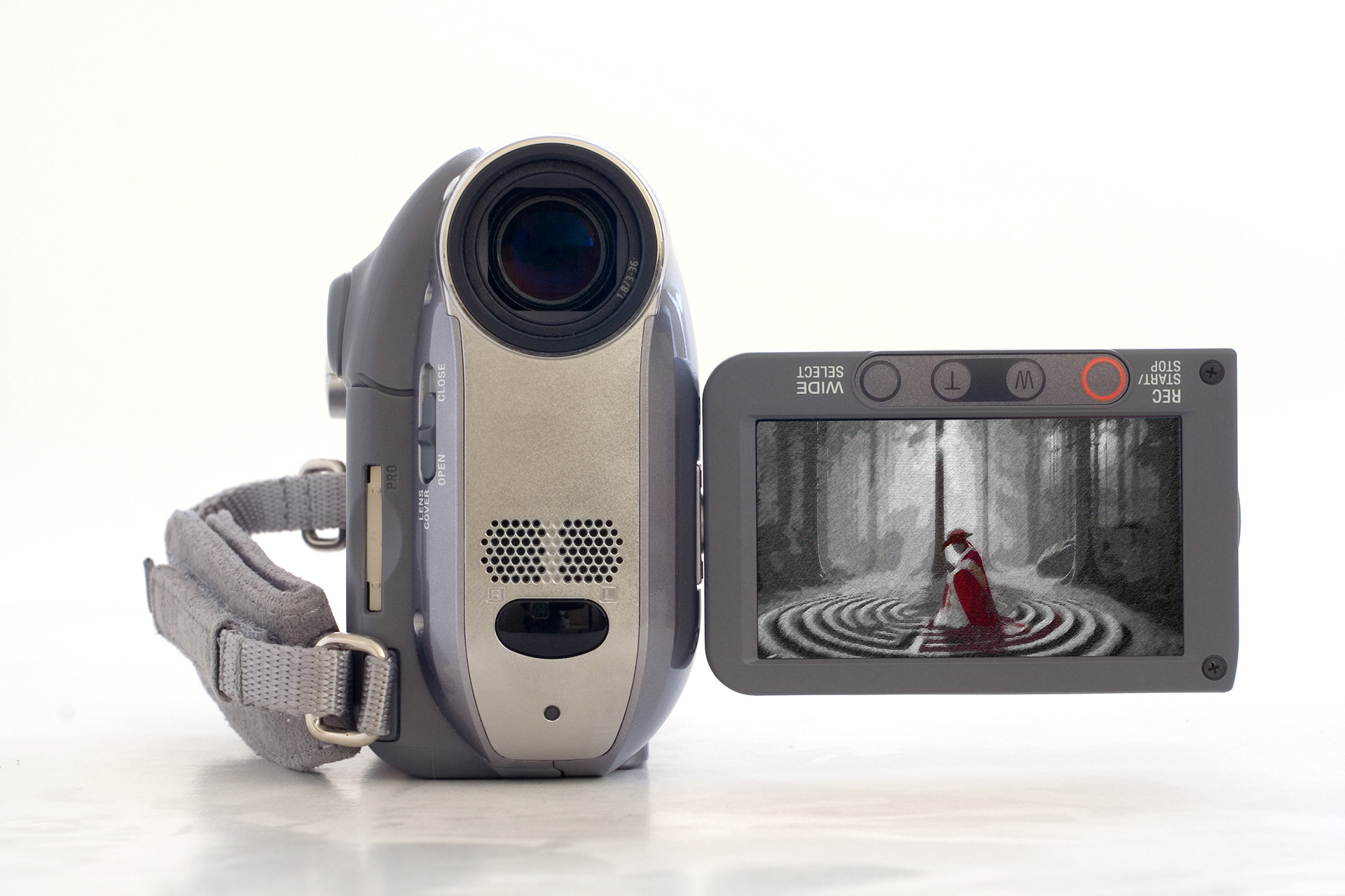
Mockup created with Adobe Photoshop and DALL·E 3
This piece will be a looping video displayed on a physical camcorder screen, showing a religiously garbed form of my persona walking through a meditation labyrinth (specifically, located at the WinShape Retreat in Rome, GA), carrying and placing severed hands (props) at specific points until reaching the center. Once there, the figure kneels in prayer, and an overhead wide shot shows the labyrinth with the hands in an arrangement around the labyrinth, suggesting an occult ritual.
This work serves as a carnal catharsis, addressing the series’ overarching theme of psychological and sexual disembodiment within Evangelical spaces, particularly for queer individuals. It embodies the cyclical nature of harm—“hurt people hurt people”—as my persona enacts symbolic retribution by severing and redistributing the hands of others, reflecting his own amputation. As the final piece in the collection, it moves beyond contemplation and critique found in the previous works, offering a visceral final reaction.
Conclusion
Overall, Do Not Enter explores the intersection of religion and sexuality through the lens of my personal journey as a gay Christian man. It reflects on my departure from the Evangelical establishment as well as my disillusionment with societal representations of queerness. For the audience, the series interrogates the boundaries we encounter in life—both self-imposed and socially constructed—revealing how these thresholds can both offer security yet impose suffocation—often simultaneously. By engaging with the work, I hope to convey that navigating these boundaries requires difficult confrontations with fear, shame, and external societal pressures. Yet at the same time, this challenging process can ultimately lead to a powerful reclamation of authenticity which is worth that cost — as exemplified in its mantra – “Because He's Worth It”.